A button can have the right color and still feel wrong the moment you move the mouse over it. Desktop themes have to account for pointer states, font metrics, focus, and the conventions of the machine running the app.
Native desktop themes are now available in Codename One, in a deeply experimental mode. This week’s release adds Fluent for Windows, Aqua for macOS, and Adwaita for GNOME. We’re keeping the current defaults while the implementation develops.
Opt in for the target you build
For the JavaSE desktop build, add this to common/codenameone_settings.properties:
codename1.arg.desktop.themeMode=native
native and auto choose the desktop family of the current machine. You can also name fluent, aqua, or adwaita when you want one look across machines. The JavaSE default remains legacy, preserving its existing selection.
For the native macOS port:
codename1.arg.macos.themeMode=native
Here native selects Aqua. The default stays modern, which is the existing iOS-style theme on this port. Selecting a mobile nativeTheme value alone doesn’t opt a JavaSE desktop app into these new desktop themes.
These are Codename One themes applied to its rendered components. They aren’t a switch that replaces each component with an operating-system widget. You retain the same Java UI and the ability to layer your own CSS over it.
Start with what the platform actually draws
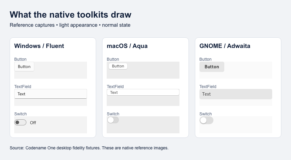
Native toolkit reference captures from the repository’s fidelity fixtures, assembled here for comparison. These show the target conventions, not a claim that the experimental Codename One themes already match every pixel.
The reference tiles include the platform, toolkit, appearance, and capture state in their manifests. A button in its normal state is a different target from the same button pressed or disabled. Light and dark modes also need their own measurements.
One useful discovery is that desktop conventions disagree about hover. AppKit doesn’t draw rollover states for the ordinary buttons, fields, sliders, switches, and popup buttons in these reference captures. The Aqua theme therefore leaves those hover appearances equal to normal. Giving every desktop control a highlight would make the Mac theme less faithful.
Windows and GNOME do use hover appearances. They need real pointer tracking, including movement with no button pressed. Touch input shouldn’t borrow that behavior just because a desktop machine also has a touchscreen.
Style hover without breaking the other states
The CSS compiler now understands .hover:
ActionButton {
    cn1-derive: Button;
}

ActionButton.hover {
    color: #ffffff;
    background-color: #2458a6;
}
Apply the UIID in Java:
Button action = new Button("Open project");
action.setUIID("ActionButton");
Use this as an application-specific choice. A themed control without a hover rule keeps its normal style. Component.getHoverStyle() returns null when there is no hover style, avoiding an empty fallback that erases the component’s appearance.
The pointer path also has to handle leaving a component, moving between forms, and distinguishing real mouse movement from touch or pen input. Those are behavior checks; a screenshot by itself cannot prove them.
Keep one vocabulary across three themes
The theme sources live in native-themes/windows-fluent, native-themes/macos-aqua, and native-themes/gnome-adwaita. The parity tests require the same UIIDs and constants across all three, with dark counterparts for entries that paint colors.
That’s useful for application styling. If your custom theme overrides a shared role, it should affect the same component family on each desktop. Otherwise “one stylesheet” slowly becomes three collections of exceptions.
For testing, you can force an appearance through Display:
Display.getInstance().setDarkMode(Boolean.TRUE);
Use Boolean.FALSE for light mode and null to follow the system. Exercise both appearances with your own theme overlays, text lengths, focus states, and input methods. The screenshots that matter most are the screens your users will operate.
Try it while the defaults stay put
PR #5845 includes the themes, pointer work, font handling, and desktop fidelity fixtures. Opt in on a branch and run the forms that mix text entry, selection, scrolling, and disabled controls. A small gallery is useful; a real editing screen finds the awkward interactions.
This week also brings the native backend, browser-capable vaults, installation-aware invitations, and Xcode 27 builder work. All of them extend the parts of an application Codename One can maintain across targets. The desktop theme work keeps that reach grounded in the machine the user is actually operating.
Keeping the existing defaults gives teams control over when their UI changes. Security requirements follow the same principle with stronger enforcement: a vault requirement must hold on the selected target, and incoming data still needs the same checks. Sharing the implementation should make behavior easier to inspect, test, and trust.
Discussion
Which desktop interaction would you test first: text editing, keyboard navigation, hover, or scrolling?